
Rebranding Winter Downs

Rebranding books is often a promotional choice. Trends in cover art changes over time. Sometimes those trends switch over the course of a single year, but as it is an expensive process publisher usually only decide that a book cover needs updating when it’s been around for a few seasons. Often this is because a series needs refreshing for a new audience who haven’t yet read any of the series, or else titles may have been included in an imprint.
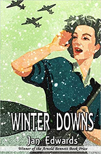
Whatever the reason it’s a good opportunity to look at various aspects of the book(s) in question (old cover below)
Winter Downs, my first Bunch Courtney Investigation, was never intended to be a series at all. I wrote it almost as a palette cleanser when the fantasy series I was deep in the throws of writing had ground to a halt and I needed to get away from its sheer complexity. When it won an award I really had to follow it up with a new case, and another until I find myself currently writing Bunch Courtney Investigation #6.
So why rebrand? For various reasons I have had to find the series a new home and it seemed like an ideal time to give this one a facelift – inside and out. So how did I go about it?
Stage one: involved a review of the text. It seemed like an ideal opportunity to revisit Rose’s first case and tighten up some of the text. Not in any great detail – it won an award after all – but to adjust a few minor details. Tweaks. I know very few writers who would ever walk away from the chance to ‘tweak’. It’s in our blood.
Stage two: was the chance to review the cover blurb with a view to Winter Downs’ status as ‘book one’ as opposed to the stand-alone that it had been.
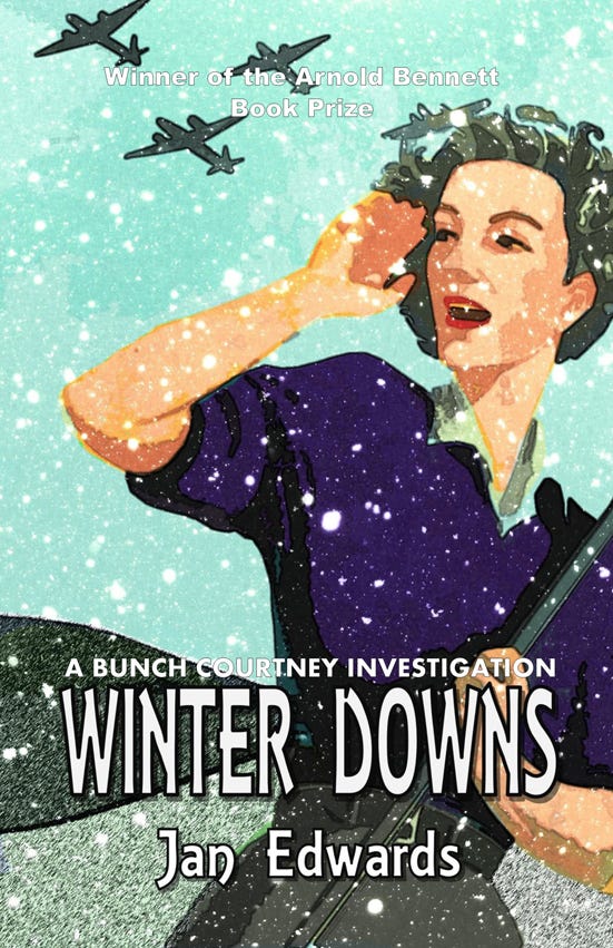
Stage three: the cover. Now I have always loved that cover and many people have echoed that affection so I was loathe to lose it. The poster style suited a book set in 1940s so adhering to modern trends was not such an issue, but I was aware that even as a forced rebrand I needed to make it clear to readers that this is slightly different to the original. Added to which I have read in several articles that both green and white covers sometimes do less well for no reason anyone has been able to ascertain. I have no idea if that is true but my original cover was categorically green… Answer? My cover designer, Peter Coleborn, was able to change to keep the essence of the original but in a (hopefully) more appealing mix of sky blue and grey. Not a huge step away from the original but enough to signal a change and more importantly I like it – a lot – and hope that readers will feel the same way.
Rebranding has been a steep learning curve and involved a lot of hours work and the new improved edition of Winter Downs will be out with The Alchemy Press in time for Christmas.
One Bunch Courtney Investigation rebranded and five to come in the new year!
